Krysta Mae Ceramics
Krysta’s work is soft and soulful rooted in home, memory, and movement. This project was about building a visual and digital language that felt just as personal. From logo to layout to storytelling, every detail was crafted to reflect her world and welcome visitors into it.
Krysta Mae Ceramics
Client: Krysta Mae
Project: Full Brand Identity, Photography & Website Build
Platform: Squarespace
Website: krystamae.com
The Challenge
Krysta’s work blends natural minimalism with inspiration drawn from travel and California landscapes. She needed a brand identity and website that captured this poetic, tactile world without overpowering it. The challenge was to craft a complete visual system logo, content, photography, and digital experience that reflected her values, elevated her work, and helped customers explore her collections with ease and emotion.
What We Did
Brand Identity & Logo Design
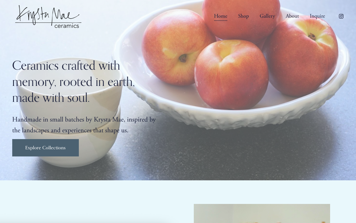
Designed a refined logotype to match Krysta’s clean, organic aesthetic
Built a brand palette around soft earth tones and quiet neutrals
Selected elegant, modern typography to reflect both craft and professionalism
Wove the tone of voice into every piece of copy thoughtful, inviting, and grounded

Site Design & Content Strategy
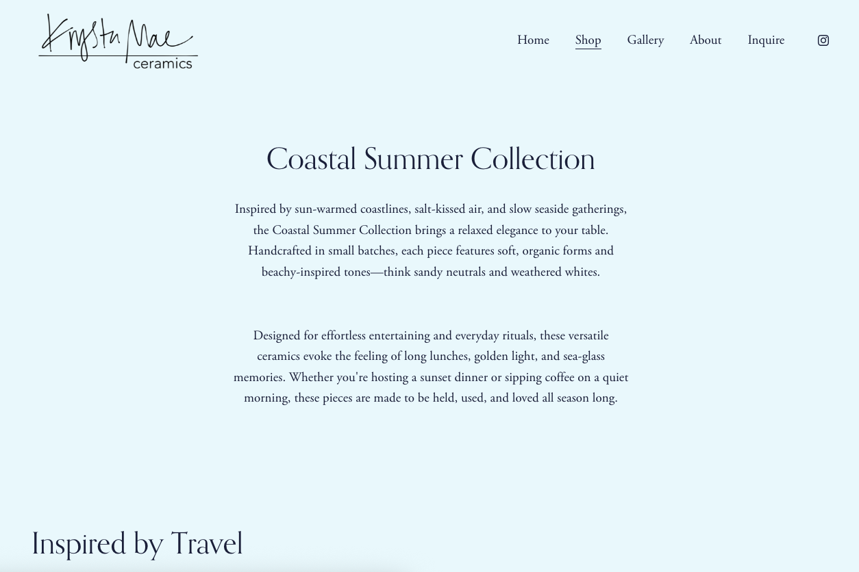
Built a Squarespace site from scratch with a structure designed around storytelling
Created dedicated sections: Work, About, and Inquire
Used travel-inspired narratives to anchor each ceramic collection
Structured layouts with generous spacing and gallery-style image presentation
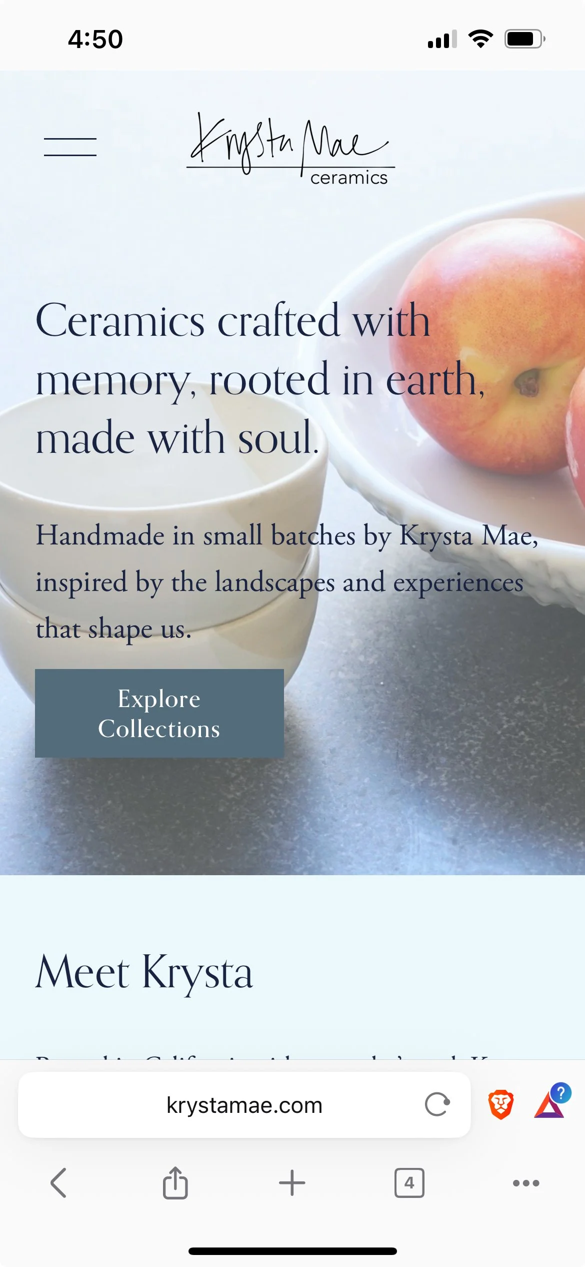
Focused on mobile-first responsiveness and smooth browsing across devices
Product Photography
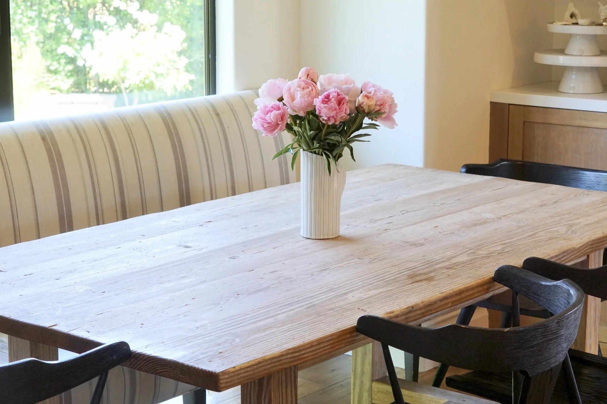
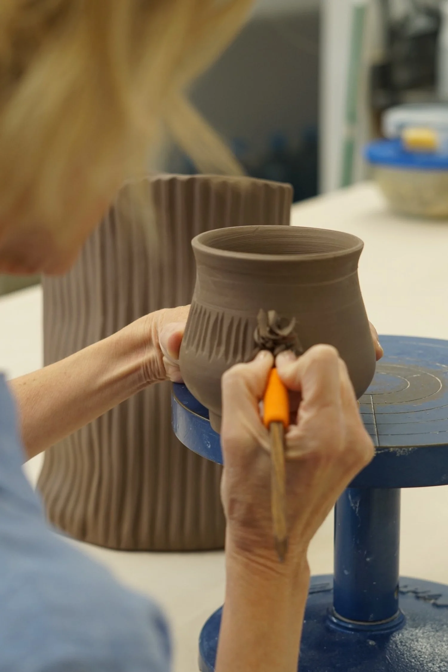
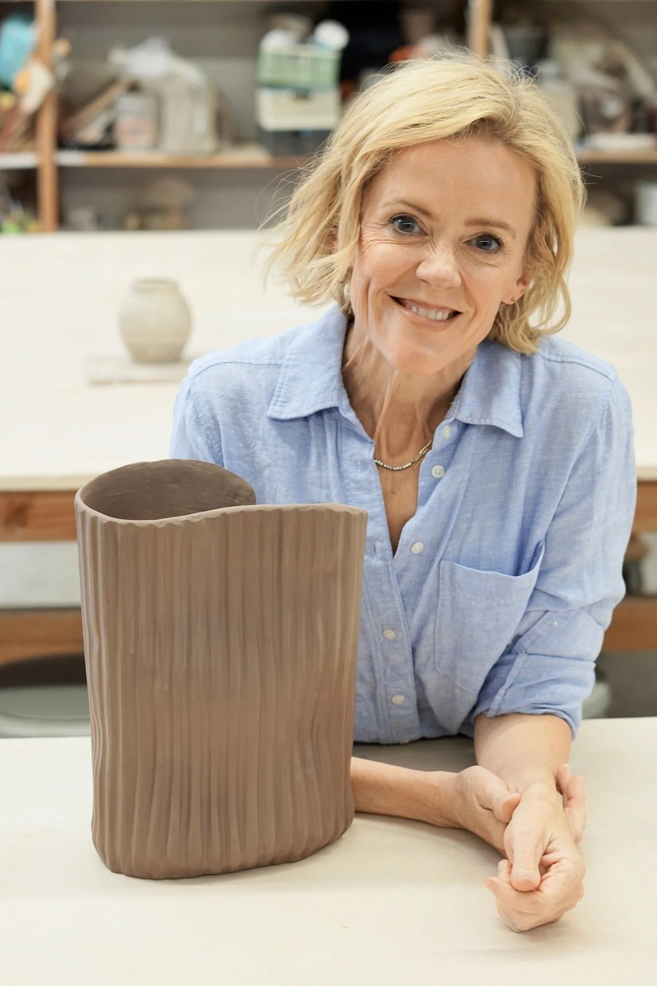
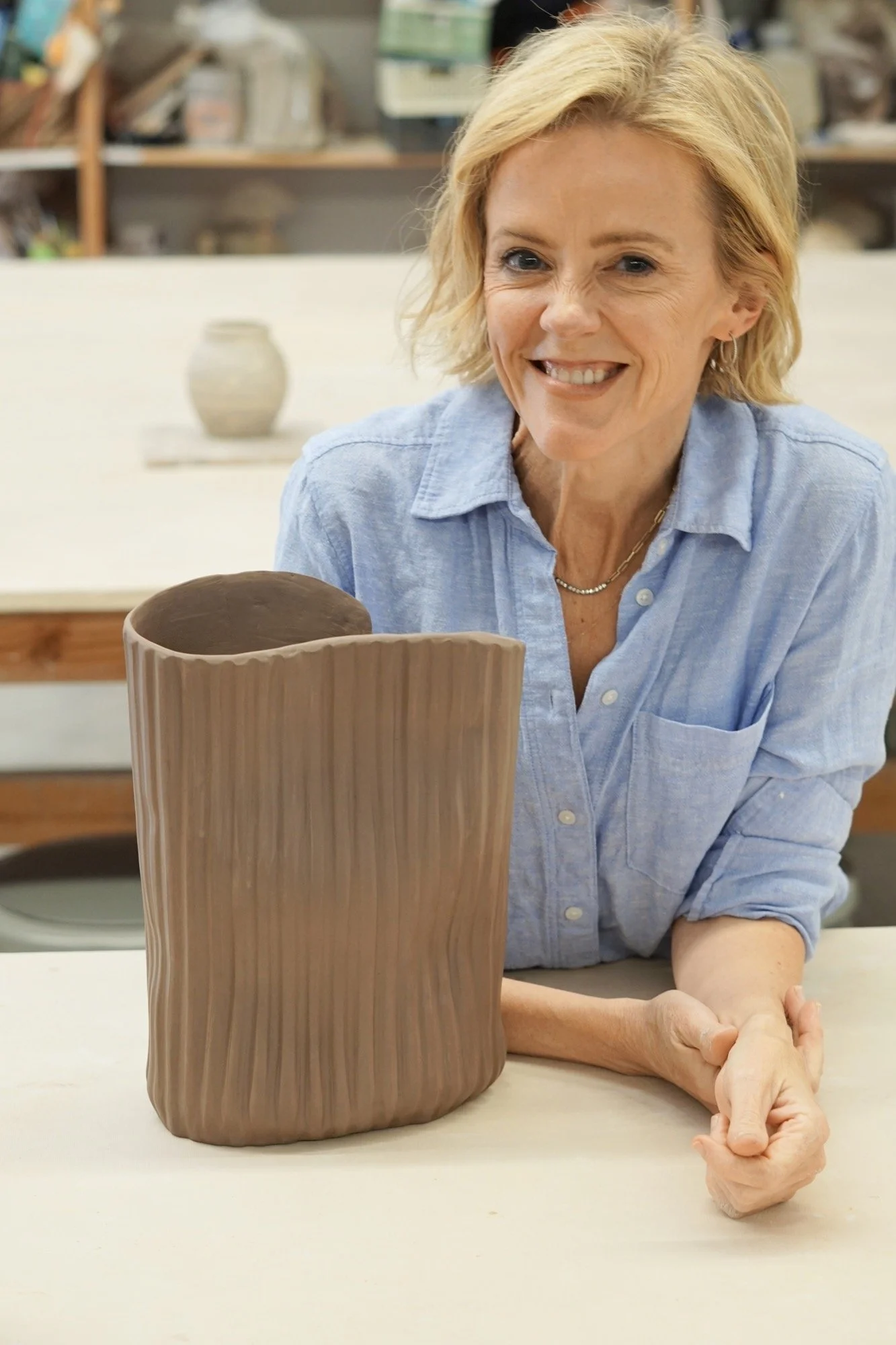
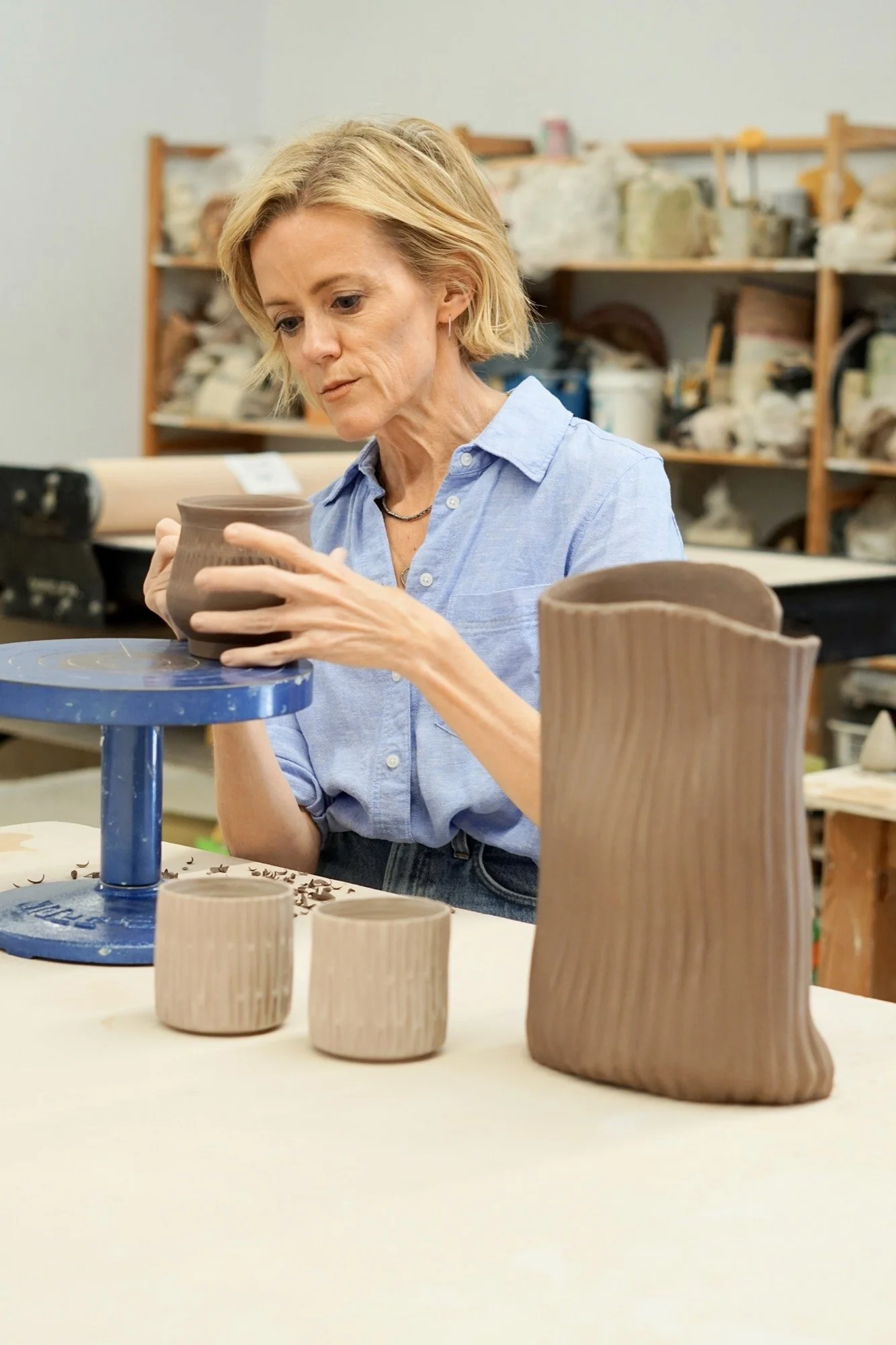
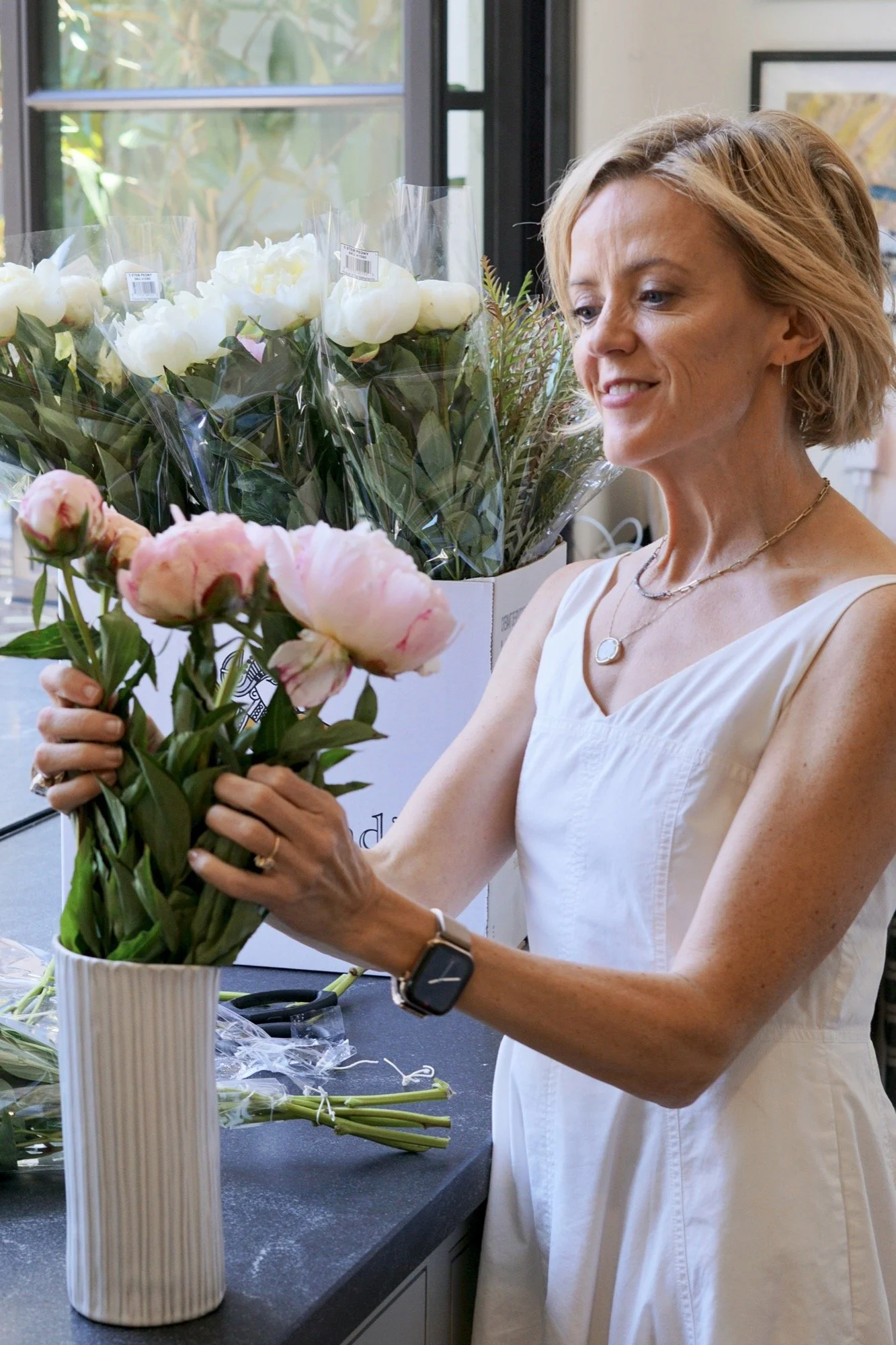
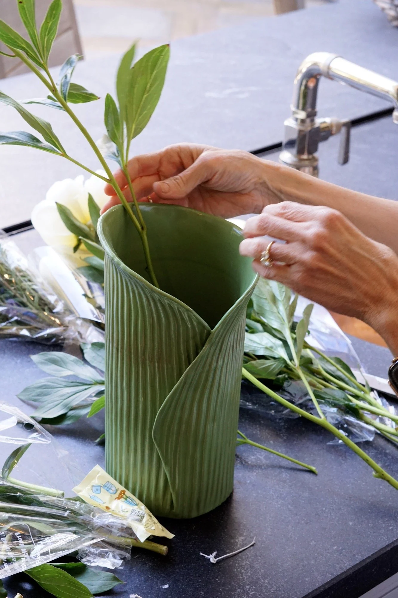
Shot and edited all product photos in soft natural light
Captured the tactile qualities of each piece from carved textures to glaze variation
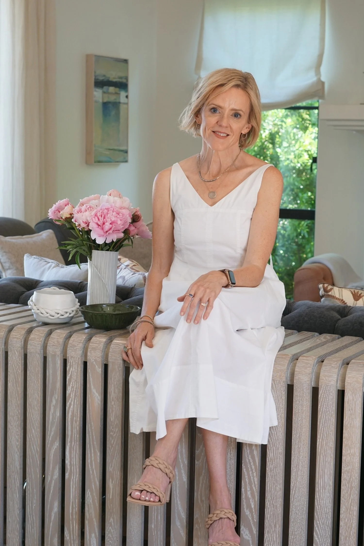
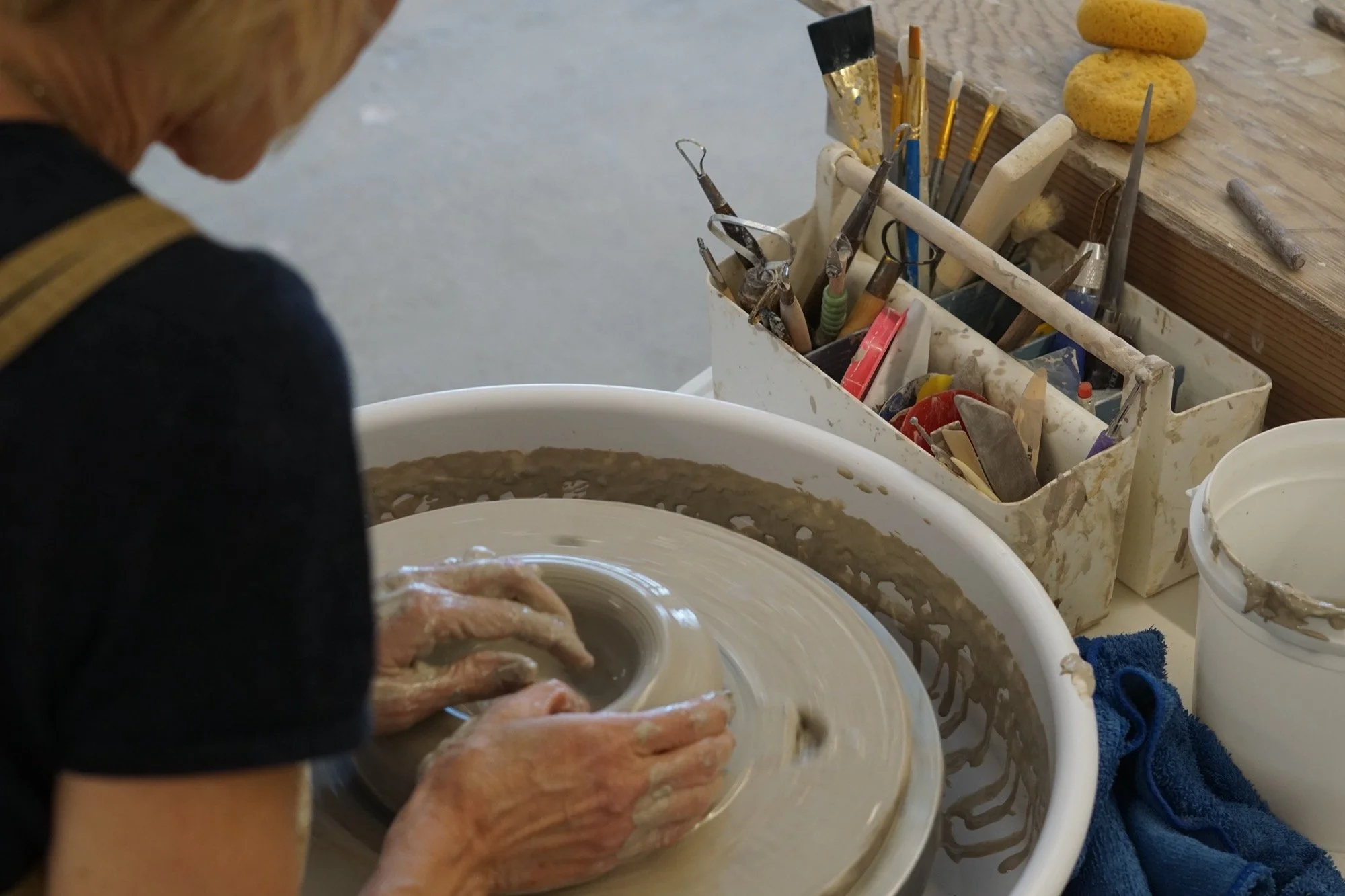
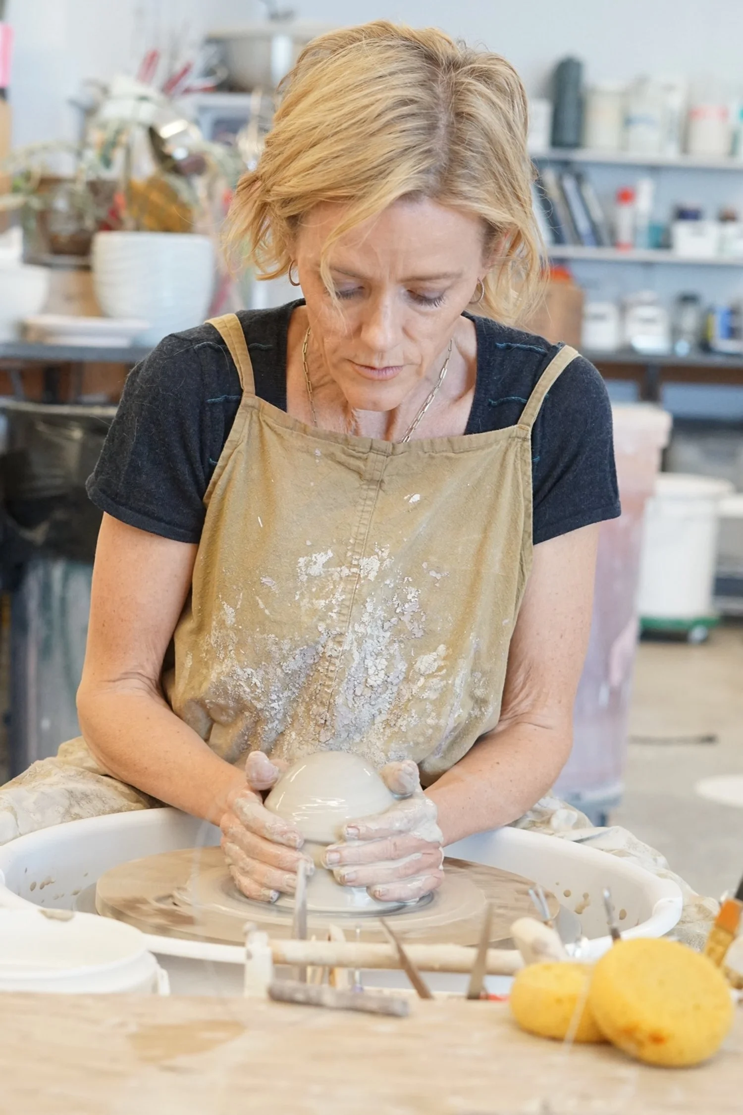
Styled imagery to feel personal and reflective of Krysta’s home and studio life
Integrated lifestyle and travel imagery to deepen the storytelling connection

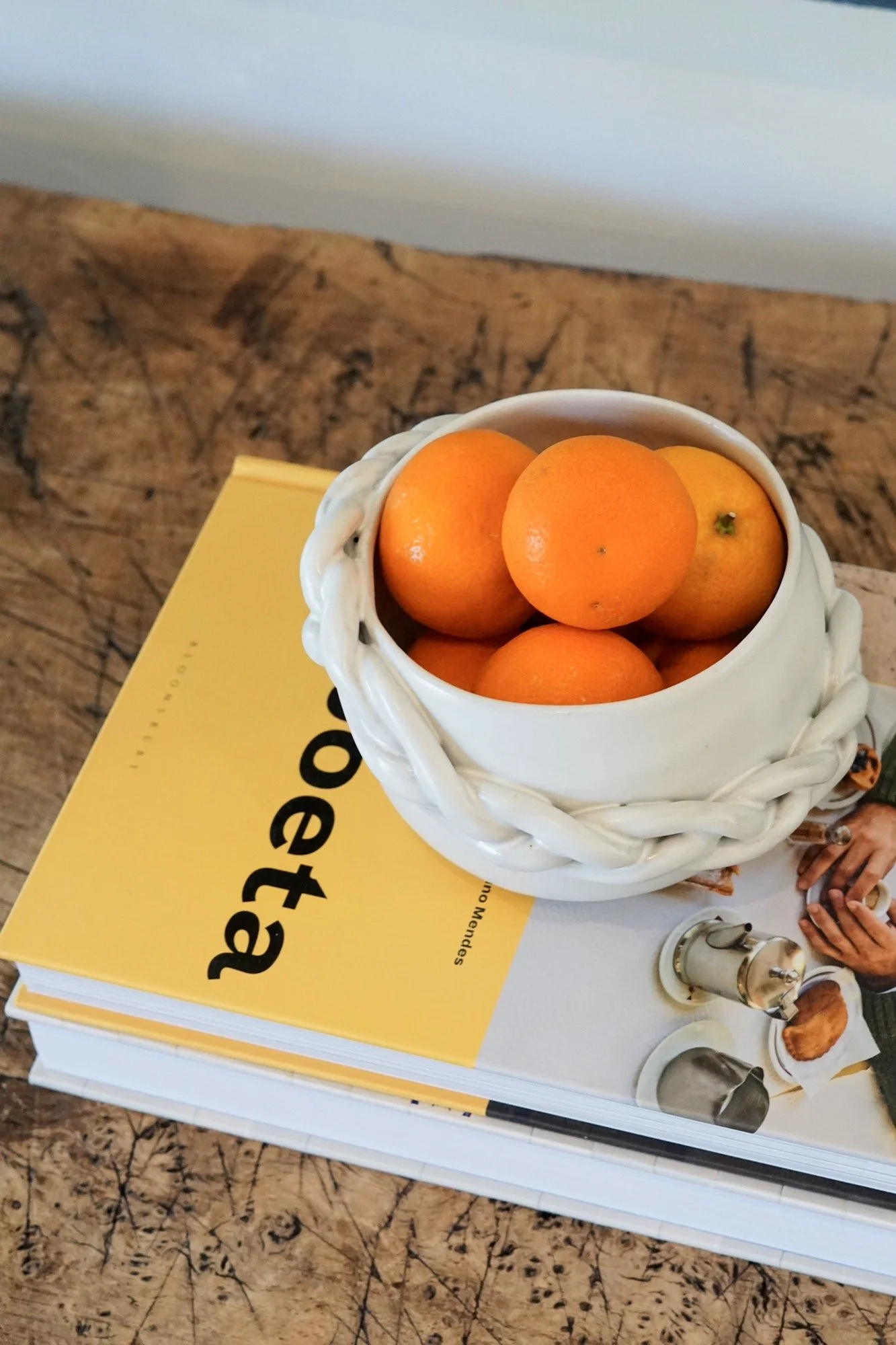

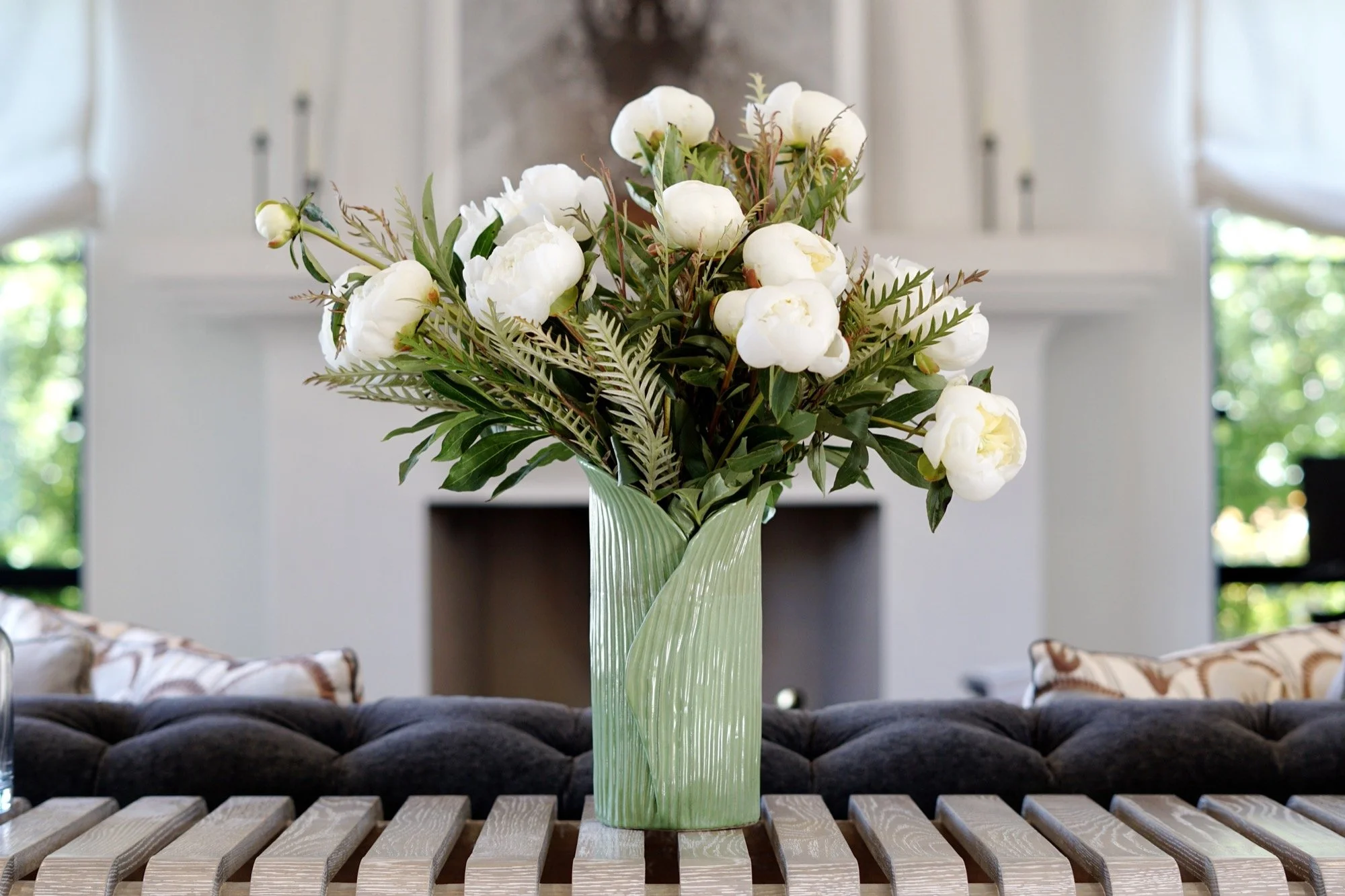

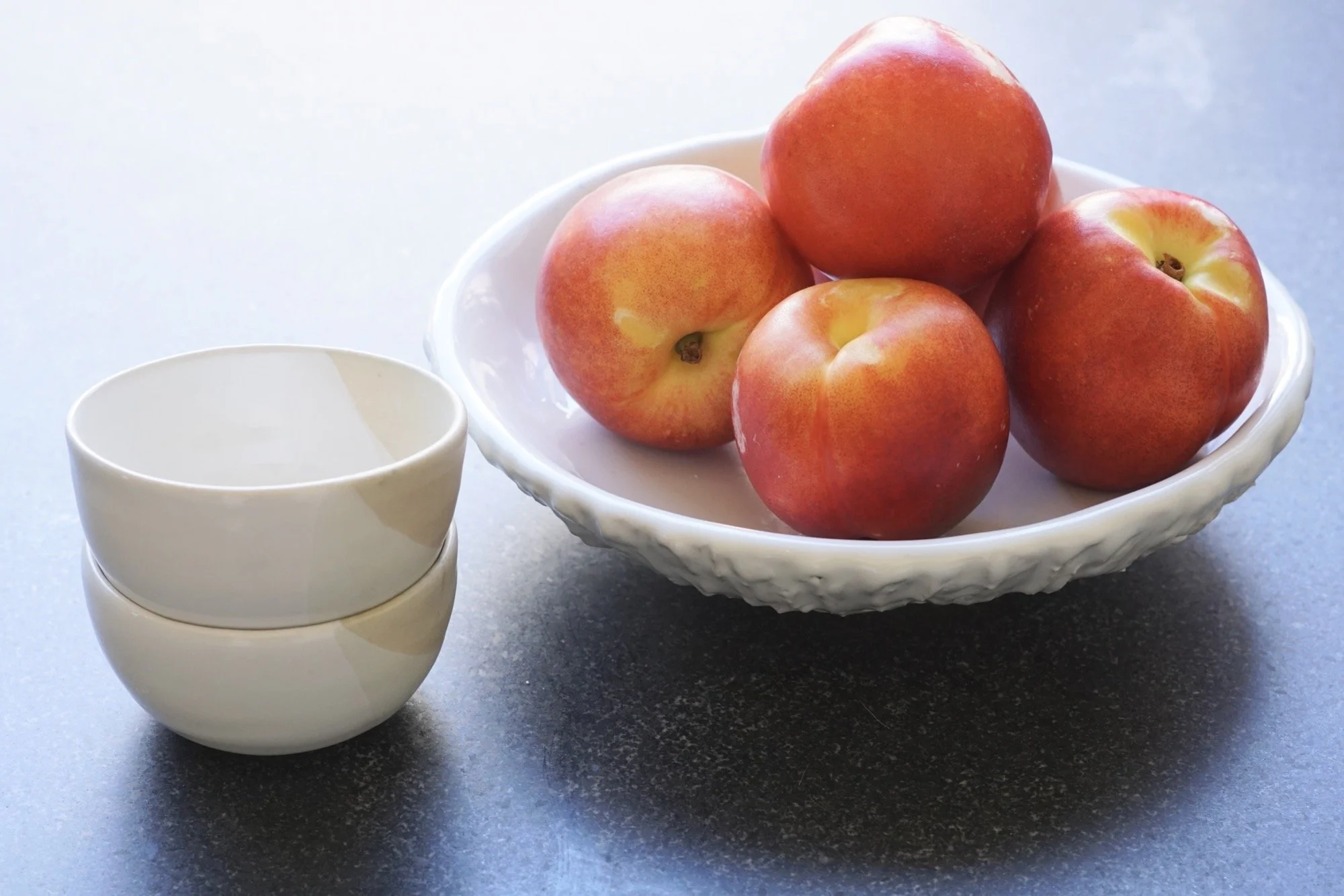
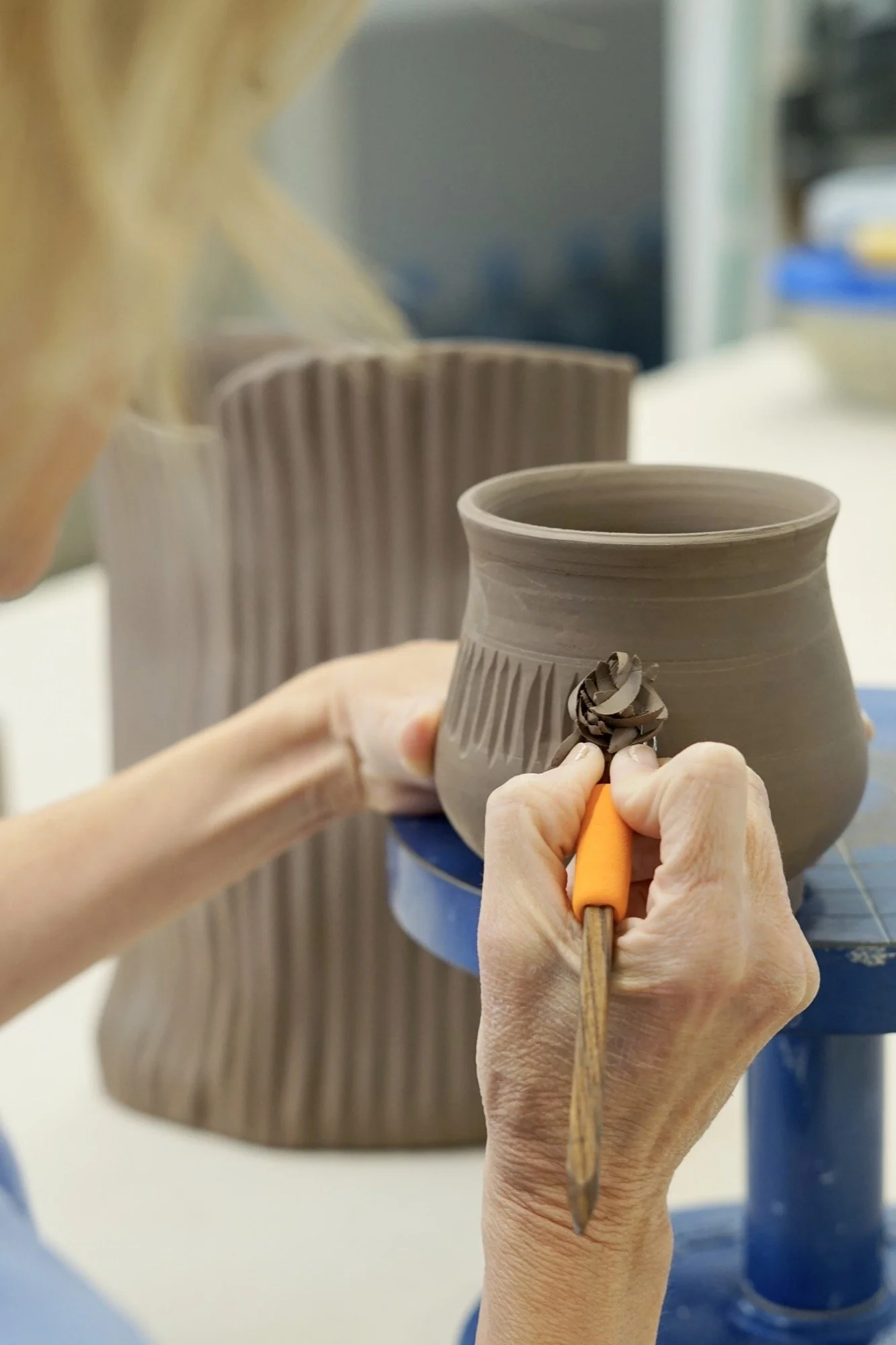
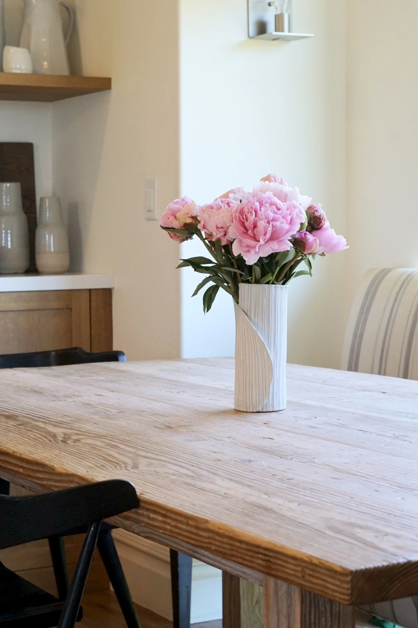
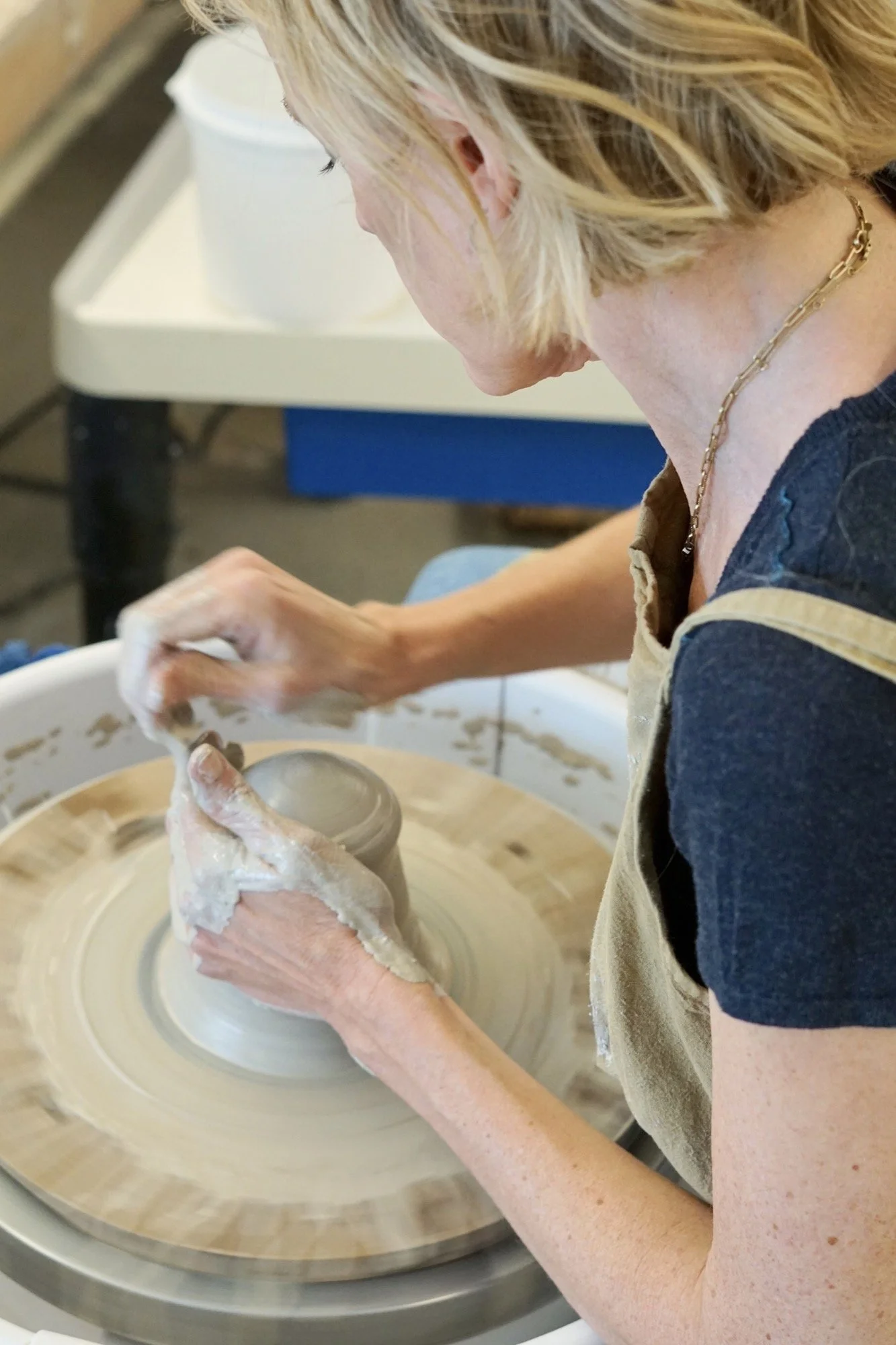
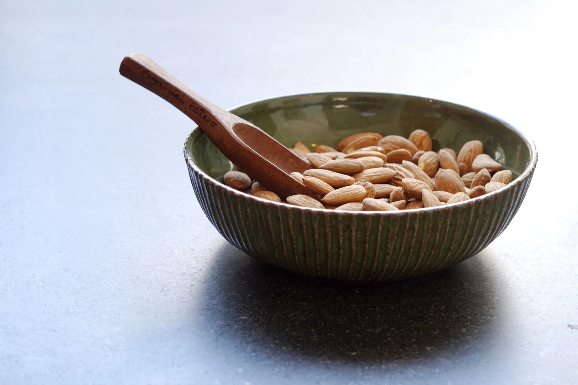


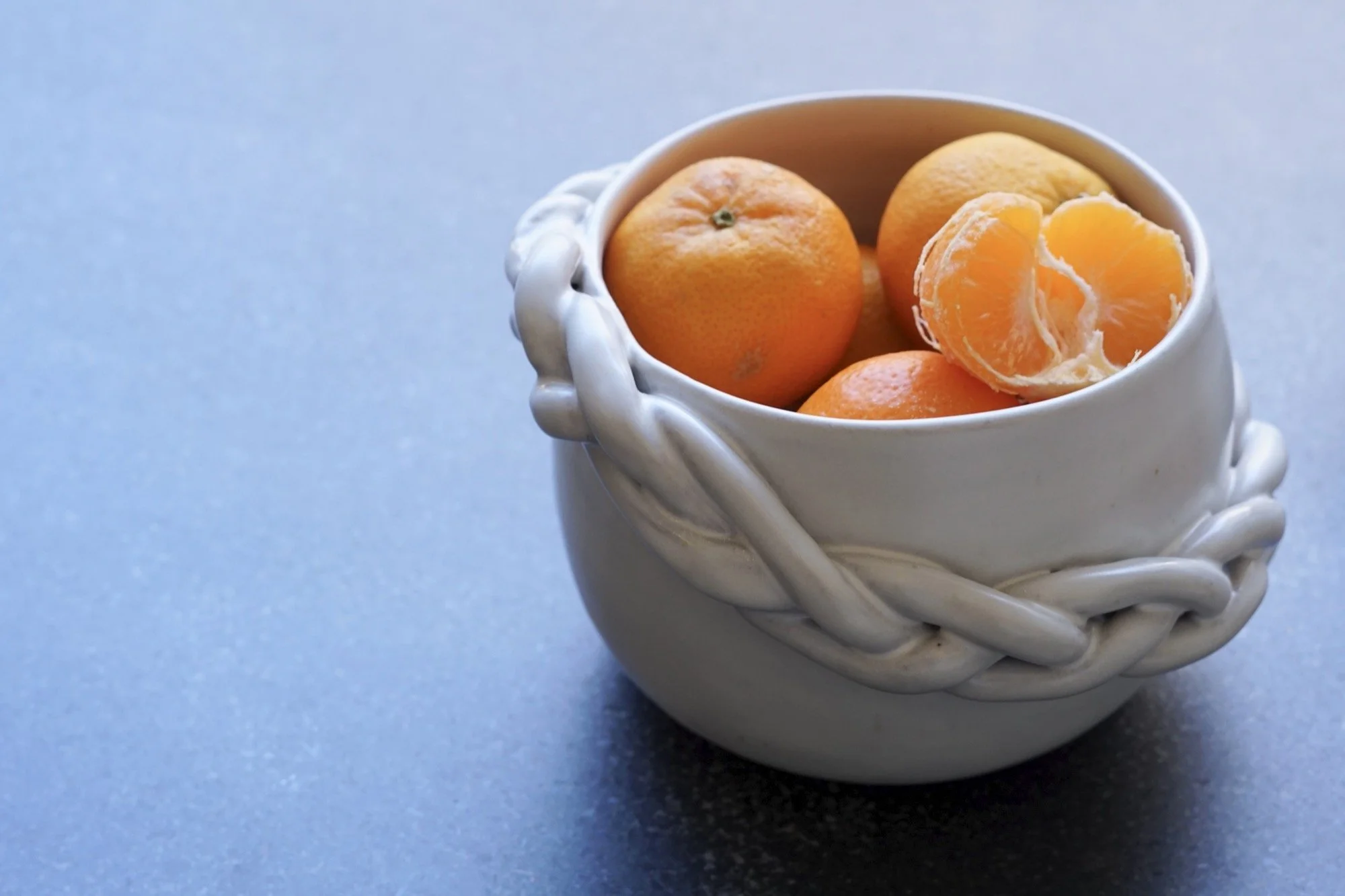
Narrative-Driven Shop Setup
Created collection pages grouped by seasonal or mood-based themes
Used storytelling to guide product discovery instead of traditional filtering
Wrote all product and collection copy in a poetic, story-led voice
Enabled simple, intuitive shopping functionality without losing the brand tone


Brand Reflections
Krysta’s ceramics carry a sense of calm soft forms, warm palettes, and travel-worn inspiration. The site was designed to echo this feeling: spacious, personal, and serene. Every detail, from a line of copy to the way a bowl is lit in a photograph, was crafted to slow things down and create presence. The brand is less about selling objects and more about inviting connection.
This project wasn’t just a site build it was the creation of a story-forward brand universe.
Outcome
A complete brand identity and logo system Krysta can use across print, digital, and packaging
A storytelling-driven website that guides customers through her work and collections
A cohesive photo library that matches the tone of her ceramics and values
A digital home that feels as soulful and beautiful as her studio practice
Why This Project Worked
Narrative at the center: Storytelling drove the entire structure, not just the content
Artist-aligned visuals: The branding and photography served the work, not the other way around
Experience-first design: From homepage to checkout, the site mirrors Krysta’s aesthetic intentional, minimal, and warm